Behind the scenes with Avenga Personality: Insights from the HR Director at Avenga Germany
Gain valuable insights and expert advice from Ralf, an HR Director at Avenga Germany, as he shares his career journey and experiences as an HR specialist.
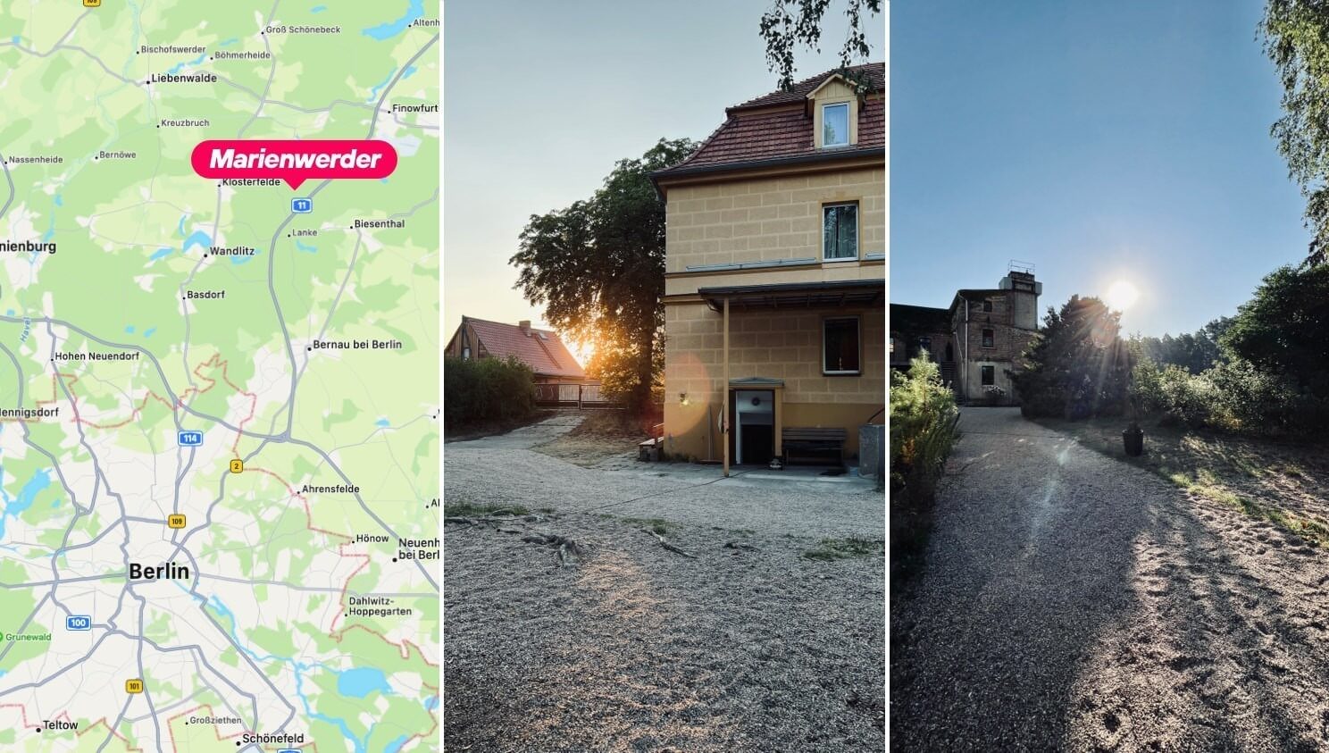
After three years of COVID restrictions, the time had finally come again: Our “Strategy & UX” team met in person for an offsite in Marienwerder near Berlin. Of course, we have also seen each other in between, but mostly only virtually. Besides, the team has grown by some members in the last years, who had never seen the rest “in real life”. So it was high time for a meeting! In the late afternoon we went to an old hunting lodge, which is now an event location. There we could also use the garden, the fireplace with grill and various leisure facilities.
While we looked after our various customer projects in the mornings, we used the afternoons for workshops. In order to clear our heads of ingrained thought patterns, we dedicated ourselves to a fictitious task: to develop the ugliest and most user-unfriendly search for a fictitious travel provider. It wasn’t easy to throw our usually high quality standards for perfectly designed user guidance overboard and just go for it! Here are some impressions of the worst user journeys we could imagine: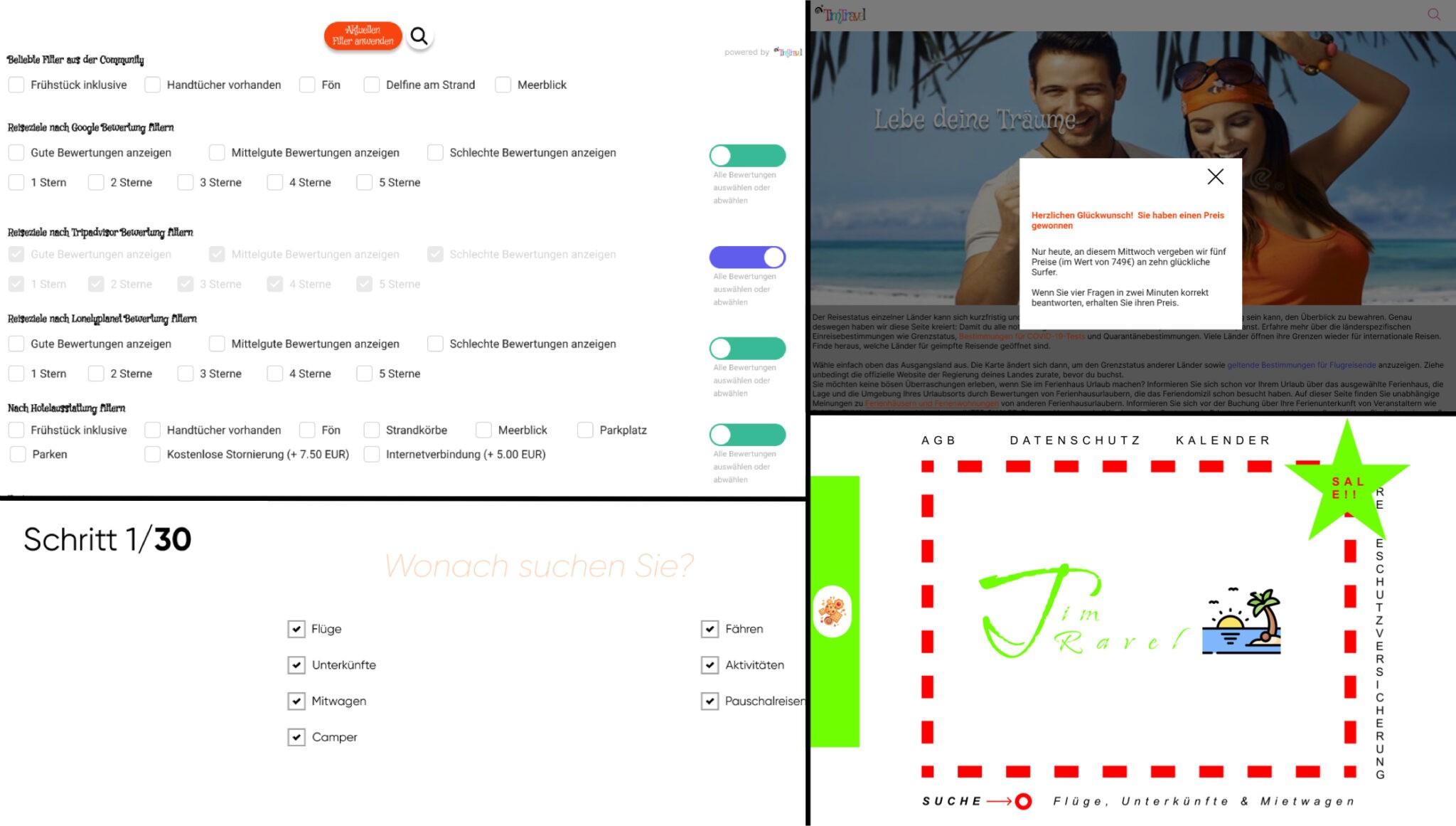
From 30-step filtering to terrible color contrasts, unruly toggles, and the ugliest fonts in the world, there was a lot on offer! The user interface was chaotic, the texts barely readable – just the way we don’t usually do it.
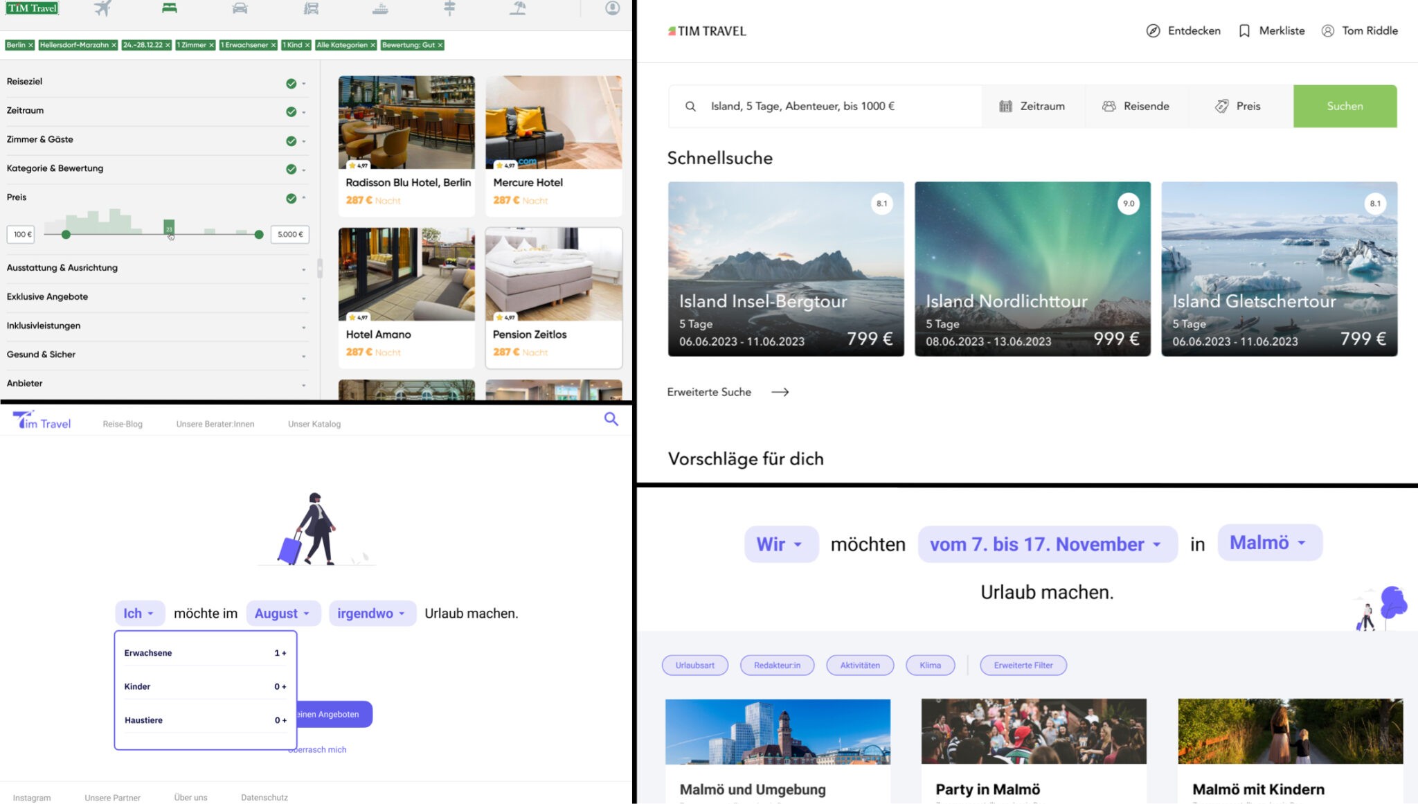
After we recovered from the sight, we went into the second round. This time, we wanted to develop good, convincing solutions. The learnings from the first round helped us a lot. Can you see the difference?
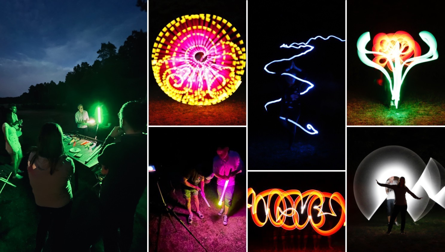
After work was done, we were able to experience a special highlight: A light painting workshop by our colleague Frank. As a passionate photographer and expert in light painting, he showed us how we could draw impressive pictures with light using long exposure and self-built equipment. A great memory of this offsite!
Gain valuable insights and expert advice from Ralf, an HR Director at Avenga Germany, as he shares his career journey and experiences as an HR specialist.
Once a year, we come together at our hackathon to work on projects that we are passionate about.
Our veteran Markus set up Quality Management at Avenga and lets you know how he did it.
The cheerful, cosmopolitan and travel-loving Julia joined Avenga as a Digital Consultant in May 2019. Julia has already experienced quite a lot: for example, she was involved in a research project in which she conducted …
Our dear strategy expert Stefan has a lot to tell us! Not only does he explain his daily-routine in his professional life with all its challenges as well as its advantages, but he also gives us a closer look at a donkey …
He started working for us in the middle of Corona times and is now with us for more than a good year. We can’t think of a life without our humorous and competent software architect Cem Derin. Therefore it is time for a s…
I started as a “typical” UX/UI designer and have been developing my skills focusing on design systems. As a Design System Architect, I ensure that websites do not descend into chaos and follow a systemic structure includ…
Christian started as a PR Manager at former Sevenval in May 2017. Now he is in charge of the Avenga Germany Marketing team and tells us more about his passions today: Tea, 1. FC Köln, Xbox, and good teamwork! Here we go,…