
AI’s omnipresence in today’s and future telecom industry explained
Learn how AI is transforming the telecom industry and dive into its power to enhance customer experience in 2025 and beyond.

Staying at home and following the strict rules imposed by our governments, has become exhausting already for many of us and we feel like it has been going on forever. As much as we love our spouses and children, spending 24/7 together is generally not a normal thing we do. We were not prepared for social distancing and doing everything online. There are so many questions and a need for answers, and many of us are becoming impatient.
On the national and global level, answers have become even more complicated.
Healthcare wants to know if the current restrictions will support or hinder its limited capacity to cope with the most seriously ill that require hospital care.
All the businesses want to know how long the business restrictions will be in place as they seriously impact their revenues, keeping jobs, opening credit lines, and so much more as all of it depends on the length of time and depth of the crisis.
Governments want to know how much money from the budget to allocate towards helping businesses, how harsh the restrictions should be and for how long, and how strongly they are supposed to be enforced to be effective. Also at some point the medical consequences of harsh restrictions will work against the goal of saving human lives – for instance more deaths will result in the case of a total global economic collapse than from this virus. So where is this optimal point?
So, the results of data analysis have a direct impact on our private and professional lives. They do matter.
Let us use this article as a way to help you understand the common misconceptions and myths which are unfortunately repeated very frequently in the news.
We used to hear the term ‘exponential growth’ all the time. But a true data scientist must object, so what is the typical growth model for virus pandemics?
Exponential growth is a mathematically convenient model for the early stages of an outbreak of an infectious disease. Existing methods for producing epidemic forecasts often make the implicit assumption that growth is exponential, at least while susceptible depletion remains negligible. However, empirical studies suggest that many infectious disease outbreaks display sub-exponential or polynomial growth early in the epidemic.
We know that the spread of COVID-19 is not going to follow an exponential curve forever. Typically, the number of new cases rises rapidly, peaks, and then declines. It’s called the epidemiological curve. We have already seen it in China and Korea with COVID-19. Flattening the peak to avoid overloading the healthcare system is seemingly the main medical goal of the extreme containment policies we have seen to date.
To understand the current COVID-19 pandemic curve, we need to evaluate time series data of the confirmed cases based on a statistical approach. The results show that the COVID-19 pandemic curve had exponential growth initially, but starting at a certain point the polynomial curve of the 3rd order reflects the data even better.
The fitted exponential curve of the form n(t) = n0bt has a growth rate of 1.08. We could interpret it as: for every 100 sick people, they infect 8 more people daily. Although the number seems to be small (and it is thanks to preventive methods in action), it already adds so many new cases to the total amount. Without intervention, the COVID-19 curve would have been much steeper.
Despite the fact that the exponential curve combined with a polynomial curve reflects observed data almost perfectly, such an approach for an infected population projection is subject to high risk due to changing situations daily. Only in China, the first wave of the pandemic has reached its end. The rest of the countries are still active areas and at the time of their peak; the infected population size will depend on the effectiveness of the community supported national action policies, such as social distancing, health system capacity, access to food and medicine, and others. The repeated projections are necessary to control the curve.
Please see details of the implementation in the article.
There are errors in data everywhere, all the time. We don’t exactly know how many people have been tested, how many are ill without showing symptoms, etc. How can modern data science deal with all that inaccuracy?
Mistakes are highly undesirable in the data science arena. A wrong sample will lead to untrue statements. Inconsistent and miscellaneous data is a trap that can lead to false estimates, predictions, and conclusions. If a data scientist suspects the data to have errors, there are a few ways to cross-validate the assumption. First of all using alternative data sources. Try to look for similar or related datasets and compare how much they differ from each other. In the case of the Coronavirus pandemia, it would be useful to compare mortality and disease (flu, pneumonia) rates with the same period of time in previous years.
Usually domain knowledge helps to avoid erroneous conclusions. During the COVID-19 pandemic, the sample of people being tested in different regions is not identical. In some cases the total population of an entire city was tested, in others only selected individuals, usually in serious condition with all the symptoms of Coronavirus. This definitely influences the total number of cases detected, as well as the mortality rates within a region.
In most cases, we as data scientists cannot control how the data is collected, how many entries were not input into the database, etc. In a situation like this, it might be better to take data from the sample, in a quality of which you are the most confident and use it for analysis, specifying the population size and confidence interval for all outputs.
Instead of just sitting and waiting, our Data Science Team decided to take action. And the best way was to join other data science teams and work together to find the best solution, helping to analyze the current situation, and improve the accuracy of the predictions.
The help term is usually limited by the media to producing medical equipment, delivering support for those in need and following the government regulations and recommendations. Of course data scientists, as humans, can do that too.
But there’s so much more they can do.
Our first step was to take part in the Roche UNCOVER Challenge (more info could be found here: https://www.kaggle.com/roche-data-science-coalition/uncover).
The main goal was to analyze a collection of datasets from 20 global sources and answer key questions.
There’s been a lot of tough questions to analyze and answer, but we also want to take a closer look at Ukraine, specifically.
We analyzed the available data through the prism of policies implemented by governments of almost every country of the world. What are the most common restrictions due to COVID-19? When did the governments start to react, and how did the speed of their reaction influence their current situation?
We were also curious, as well as most citizens, does staying at home really help? How would the virus spread rate and the situation in general change, if we were not on quarantine?
Data can answer most of these questions if you aggregate and interpret it well.
After illustrating answers and suggestions to the above questions, we took a closer look at Ukraine and analyzed how well prepared and equipped were the hospitals in the country to fight the virus.
The most important conclusions from our analysis are the following:
1. Countries that introduced quarantine policies before the first case of coronavirus was registered in their territory generally tend to have a lower number of infection than the countries, who were a little bit slower to react. For example, the average number of infected per 1M of the population in ‘early bird’ countries is 150. When in contrast, the ‘late’ countries have 345 infected/1M. That is a 2.3 difference! We cannot stress enough how important it is to follow the quarantine and social distancing. It makes a significant impact!
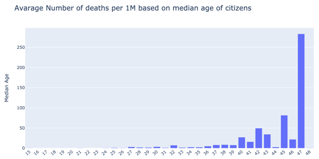
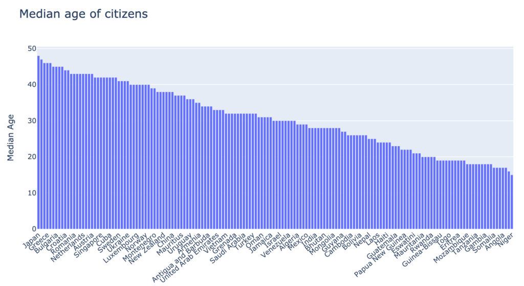
2. The higher the median age of the country’s population, the higher the mortality rate from COVID-19. It supports the claim that the virus is more dangerous to older people, thus the higher mortality. The countries with a median population age over 40, suffer greater losses than the younger populations.
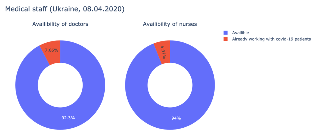
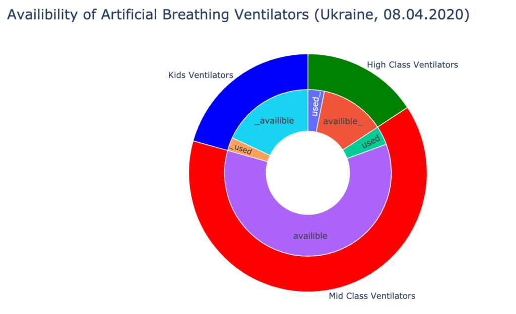
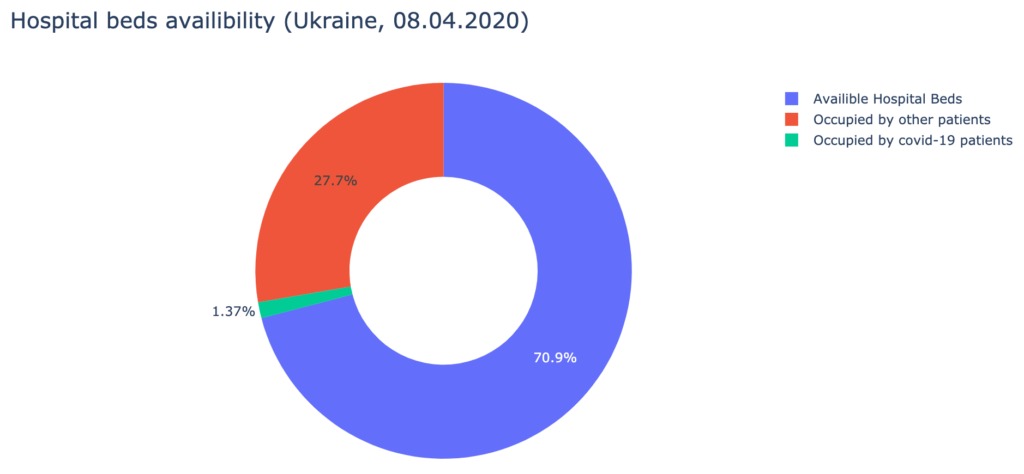
3. Analyzing the data provided by the Cabinet of Ministers of Ukraine about hospital beds, medical staff, and ICUs availability, we have found out, that Ukrainian hospitals are well-equipped to treat the patients. As of the 8th of April, 730 doctors and 1287 nurses are already occupied with COVID-19 patients. It is about 7% of all medical staff, qualified to work with infected patients. Over 90% of artificial breathing ventilators are available.
 4. Everyone wonders – what is the future, can we predict how many people will get infected, when will the quarantine end, and when will the virus stop spreading? Performing any kind of predictive analysis would involve a very vague hypothesis that the situation is static, when in reality, it is anything but static. There exist multiple factors that prevent us from building a robust machine learning model. For example, it is difficult to predict how well the citizens will comply with quarantine policies. It is a challenge to estimate the spread rate of the virus to medical staff; how many doctors and nurses will there be available at time N? It is also hard to predict the possible date of the invention of a cure.
We wish we’d never have had to join this type of community project at all, and we hope to never need to again.
However, the results of this work are useful now, and in the near and distant future. Many of the models and characteristics of the current pandemic will help us to better understand and plan for the future. The lessons learned from the countries who were first to suffer from COVID-19 have been quickly transferred to countries who were more fortunate to join in the pandemic later.
This time it also happens in data science because datasets, statistics and models are being exchanged and built collaboratively by multiple teams from different countries for our mutual benefit as a civilization.
We are proud our Data Science Team plays an active role in this.
The best way to explore our current results is to visit our github repository at https://github.com/avenga/covid19-datascience to get the most up to date information.
The repository consists of:

Learn how AI is transforming the telecom industry and dive into its power to enhance customer experience in 2025 and beyond.

Watch our free webinar, “AI in Banking: From Data to Revenue,” to explore how AI is transforming the BFSI industry.

Explore a strategy that shows you how to choose a cloud platform for your AI goals. Use Avenga’s Cloud Companion to speed up your decision-making.

Avenga and Qinshift are excited to share the news of Aaron Wall’s appointment as Vice President of Business Development in the US and North America.

Take an in-depth look at some of the most promising asset management trends. These probably determine the future of asset management.

Read the article to learn about the latest trends in the media and entertainment industry of 2025 and beyond.
Avenga announces its partnership with Revvo becoming even closer to its UK-based clients.

Avenga and Qinshift are thrilled to announce the appointment of James Lilley – an experienced IT visionary – as Director of Business Development in the US and North America.
* US and Canada, exceptions apply
Ready to innovate your business?
We are! Let’s kick-off our journey to success!