


Business intelligence and data visualization in the AI era


June 4, 2026 9 min read 146 views
Business intelligence turns data into clarity, and data visualization turns clarity into action. The impact is hard to overstate as the global BI market alone is projected to surpass $72.2 billion by 2034. In the age of AI, the two have become inseparable and far more powerful. BI platforms now embed Generative AI and Agentic AI, natural language querying, and predictive analytics directly into dashboards. They empower employees to ask complex questions and get instant visual answers. This article breaks down what business intelligence really is, why visualization matters more than ever, and what types of leading tools your business can leverage.
What is business intelligence?
Business intelligence (BI) offers tools, methodologies, architectures, and processes for analyzing data and making actionable, informed, data-driven business decisions. BI enables executives and managers to use a range of instruments and methodologies to collect data from internal and external systems, organize it for data analysis, develop and run queries for data processing, and create visualizations, dashboards, and reports that depict meaningful and useful analytical results.
A well-thought business intelligence architecture provides an infrastructure for data collection organization, its management, and supporting technology. Together, BI and business analytics form the backbone of modern data-driven organizations.
Business Intelligence solutions help with:
- Resource optimization, as an aid with recompiling of the current reporting, data, etc.
- Cost saving, through freeing up human resources that can be engaged in other core activities.
- A single version of the truth that provides different departments of the company with the same unified information.
- Automated reporting, due to self-updating with the latest, most relevant data.
- High-level analysis that implies filtering the information at the most detailed level.
There are some clear, universally defined business intelligence objectives:
- Optimize business performance by detecting possible ways to amplify sales and lower expenditures.
- Identify niche customers and target markets using thorough competitor and market analysis.
- Improve customer experience and satisfaction by monitoring and measuring the KPIs across provided services.
Capabilities that matter today
- AI-driven data insights that detect patterns, anomalies, and trends without manual querying.
- Natural language interaction, letting users ask questions in plain English and receive instant visual answers.
- Advanced visualization beyond charts, including heatmaps, geospatial views, and interactive dashboards tailored to each role, supporting richer data storytelling.
- Dynamic filtering, drilldowns, and self-service data exploration give non-technical business users the ability to navigate data independently.
- Embedded data analytics brings BI directly into the apps and workflows where decisions happen.
Together, these capabilities make BI less about producing reports and more about powering everyday decision-making across the business.
u003cspan data-contrast=u0022noneu0022u003eBuild the future. Think ahead. Run with confidence.u003c/spanu003eu003cspan data-ccp-props=u0022{}u0022u003e u003c/spanu003ernrnu003cspan data-contrast=u0022noneu0022u003eAvenga makes it happen.u003c/spanu003eu003cspan data-ccp-props=u0022{}u0022u003e u003c/spanu003e
AI-driven data visualization and business intelligence
Business intelligence looks different now. A question that used to mean briefing an analyst and waiting two days for a dashboard can be answered in seconds. Ask generative AI why Nordic revenue dropped last quarter, and you get the chart, the likely reasons, and concrete action points. Machine Learning inside the BI platform spots anomalies and forecasts trends without anyone asking. Dashboards reshape themselves around the person looking: a sales lead and a finance director open the same report and see different things.
Then there’s an Agentic AI. Generative AI answers; Agentic AI acts. In a BI context, that looks like data agents watching KPIs overnight, chasing down anomalies on their own, pulling in outside data, and triggering whatever happens next, whether that’s an alert to an exec or an updated forecast in a planning tool. With RAG and proper governance behind them, these agents stop being a reporting layer and start being something analysts work alongside. The shift is especially powerful for organizations dealing with big data, where manually monitoring every signal is impossible.
The experts using BI are changing too. AI copilots have made analytics usable by employees who would never have opened Tableau before. Data teams spend less time on dashboards and more time on data models, governance, data security, and guardrails for the AI itself. Power BI, Tableau, and Looker all ship copilots now; newer tools are built around natural language from the start. The expectation has flipped. For companies, that puts the pressure back on the basics: clean data, infrastructure that doesn’t fall over, and governance that holds up when the AI gets it wrong.
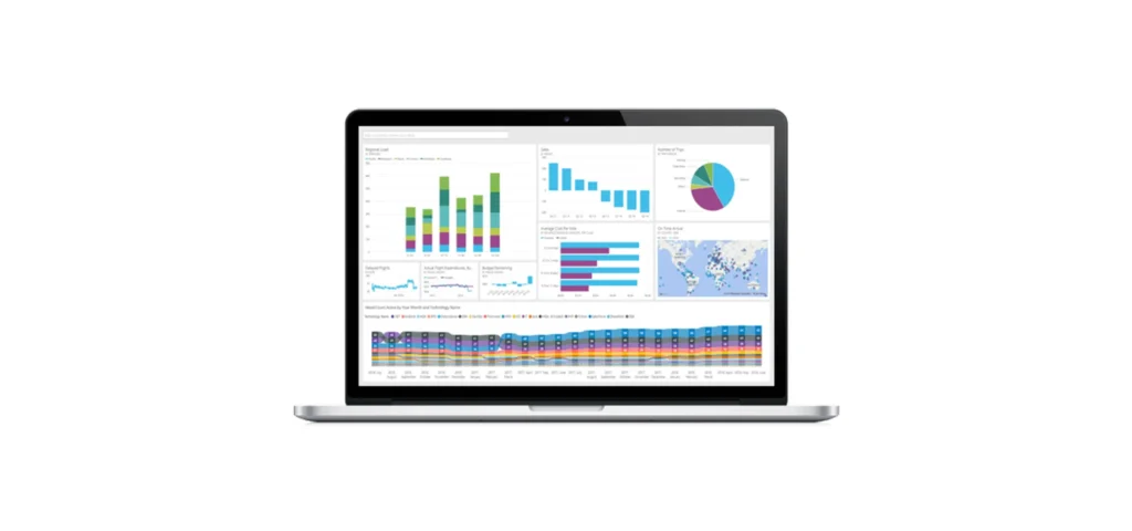
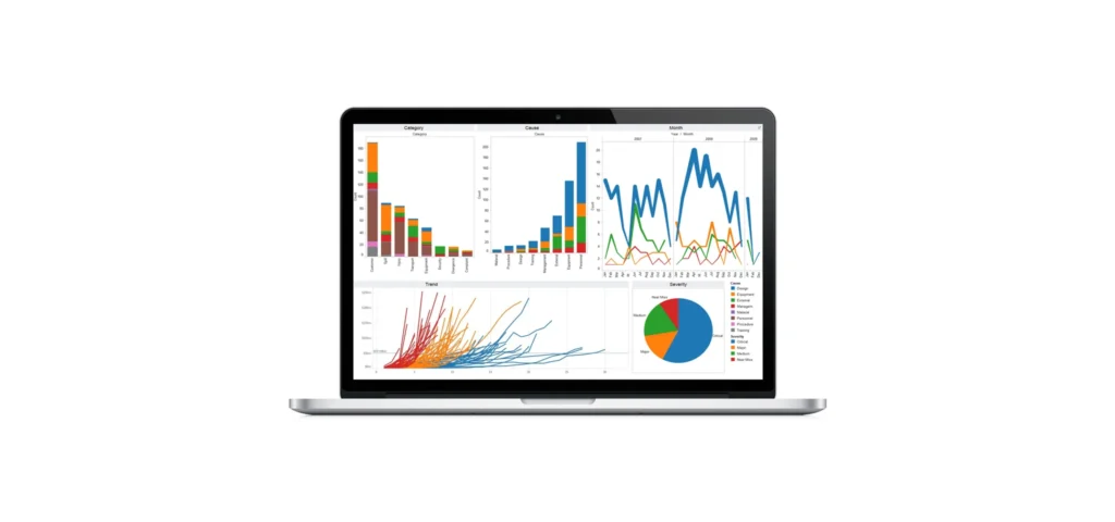
Powerful data visualization software
Of course, the types of data visualization vary depending on the needs and goals of the organization. However, decomposing data and then representing it in a simpler form makes it easy to digest and make meaningful decisions.
Be those business owners, managers of all levels or accounting, data scientists, and software engineers operating in nearly every industry, they all admit that effective data visualization is a perfect instrument to communicate discoveries in the information, as well as their causes and effects. The right tools can transform raw data into compelling, actionable visuals that drive smarter decisions across the business.
There is a wide selection of data visualization tools from which to choose. Each tool has a peculiar set of features for turning raw data into meaningful stories. All of them are unique in their combination, making them suitable for diverse business needs. Similarly, integration options and ultimate cost vary. To illustrate this, our data analysts singled out the most popular software applications and compared their visualization capabilities and integration options. They are:
- Power BI
- Tableau
- Looker
- QlikView
Power BI
A comprehensive analytics platform for data processing, Microsoft Power BI enables businesses to retrieve essential sets of data and convert them into comprehensive and visually appealing materials. It can be powered by Machine Learning algorithms to perform predictive analytics and allows users to monitor the dynamic flow of business data, from both desktop and mobile devices, making its functionality particularly convenient.
The platform has evolved significantly in recent years, with deep integration into the broader Microsoft Fabric ecosystem and the rollout of Microsoft Copilot in Power BI, a Generative AI assistant that lets users create reports, generate DAX measures, and summarize insights through natural language prompts. Native Machine Learning capabilities support predictive analytics, anomaly detection, and forecasting out of the box.
With seamless integration across Microsoft 365, Dynamics, Azure, Salesforce, and Google Analytics, Power BI is a strong fit for medium and large organizations already invested in the Microsoft stack and a robust visualization tool for companies looking to scale analytics quickly.
Tableau
Tableau belongs to Salesforce now, but it’s still one of the names people reach for first when they think about how to visualize data at enterprise scale. It pulls from a lot of data sources at once, holds up under heavy datasets, and gives you more chart types than most teams will ever use.
Two newer pieces are worth knowing. Tableau Pulse is an AI metrics layer that surfaces insights to users instead of waiting to be asked. Tableau AI sits on top of Salesforce’s Einstein Trust Layer, which is how generative AI lands inside the workflow without the governance team panicking. The integration list is long: Slack, Snowflake, Databricks, dbt, Hadoop, Salesforce itself, to name a few.
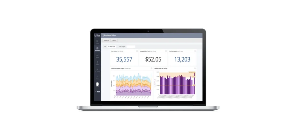
Looker
Looker is a Google Cloud product these days, and it’s where a lot of cloud-native BI work happens. The thing that makes it Looker is LookML, a semantic layer where you define a metric once and everyone uses that definition. No more arguments about whose revenue number is right. It talks to BigQuery natively, plays well with other modern warehouses, supports Git for version control, and exposes a real API for embedding, which makes data integration across the stack remarkably clean.
Gemini in Looker is the AI piece. Users can generate visualizations, write LookML, and ask questions in plain English. Looker tends to land best at organizations that already have their data house in order and want self-service analytics with guardrails.
QlikView
Qlik has come a long way from QlikView. Qlik Sense is the current flagship, AI features and all; QlikView itself is in maintenance mode. What still makes Qlik feel like Qlik is the associative engine. It keeps the relationships between every field intact, allowing users to explore millions of data points sideways without writing a query for each step. This makes it particularly strong for navigating complex data environments.
Qlik Answers and Qlik Predict are the newer additions, covering generative AI, conversational analytics, and AutoML. Qlik Cloud takes care of the scaling problems that used to come up with QlikView. If you want associative exploration, real-time data using AI, and AI in one place, Qlik holds up.
FAQ
Embedded analytics strengthen the power of data visualization
BI and data visualization aren’t about static reports anymore. They sit between the data and the decision, and AI is changing how that link behaves. Generative AI puts natural language into the dashboard. Then there’s agentic AI, which runs on its own clock and tells you what changed before you go looking. Power BI, Tableau, Looker, Qlik, and embedded tools like Logi Symphony each pull in a slightly different direction. Picking one is less about the feature list and more about which platform fits your needs and how effectively your teams can leverage data day to day.
Start a conversation with our team and discover how a partnership can future-proof your data and analytics ecosystem.


Your business results matter
Achieve them with minimized risk through our bespoke innovation capabilities. Fill in the form below.