


UX and Service Design
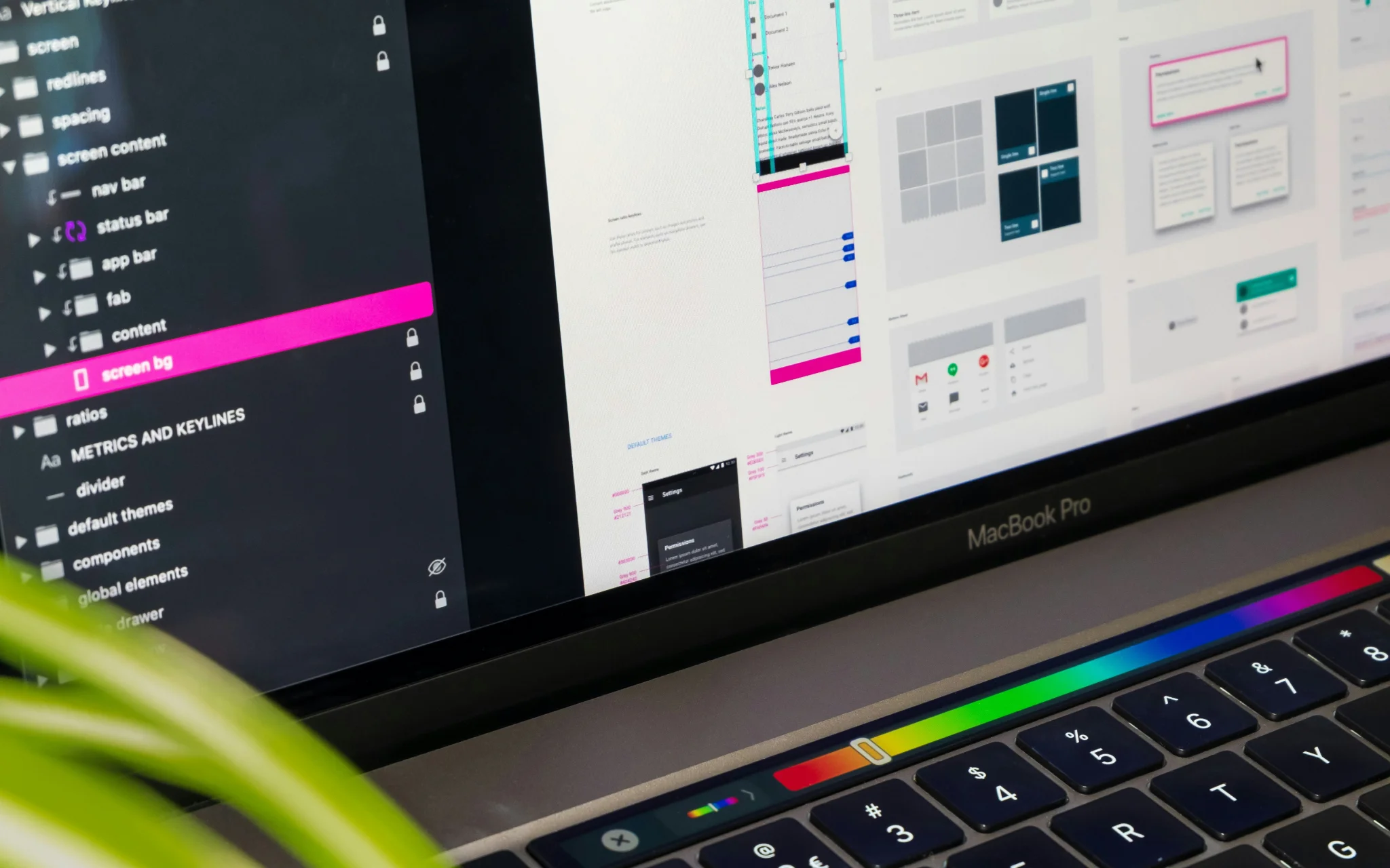
User experience is at the heart of every successful digital product. At Avenga, we craft intuitive, engaging, and high-performing designs that captivate users, elevate brand loyalty, and drive business growth. Our UX/UI services empower businesses with cutting-edge applications and platforms that deliver seamless usability and exceptional user satisfaction. Whether you need a complete UX transformation or a refined interface, our expert team ensures a visually appealing, user-friendly digital experience.
Our UX/UI Design Services
Avenga delivers user-centric UX/UI solutions designed to enhance digital interactions, streamline usability, and drive business success. Our comprehensive services cover every stage of the design process, ensuring that your product meets both user expectations and business objectives.
Design Consulting

Revolutionize your digital strategy with our expert UX/UI consulting. We help businesses tackle design challenges, refine user experiences, and adopt a customer-first mindset. Be sure that your designs maximize usability, and drive user engagement.
Design Discovery

Understanding your audience is the foundation of great design. Our cross-functional experts conduct deep research to identify user pain points, define the ideal product vision, and develop a strategic design roadmap tailored to your business goals.
Prototyping

Bring your vision to life before development begins. Our high-fidelity prototypes allow you to visualize, test, and refine your digital experience early on, identifying usability gaps and perfecting functionality before going to market.
Design Delivery

From concept to execution, we transform ideas into stunning, scalable digital experiences. Our designers work closely with developers to create visually appealing, intuitive interfaces that integrate seamlessly into functional products.
UX Audit

Is your platform falling short of expectations? Our UX audit uncovers usability gaps, friction points, and inefficiencies, using data-driven insights to deliver actionable recommendations that enhance engagement, retention, and overall satisfaction.
Let’s build a digital experience that sets you apart.
Proven Success: Elevating Businesses with UX/UI Innovation

Swiss Life: Top-Performing Client Portal

Advanced chat functionality that boosts customer engagement

An advanced fleet management system for trucking companies
Why Choose Avenga?
Choosing the right UX/UI partner can make all the difference in delivering seamless, engaging digital experiences. At Avenga, we combine expertise, agility, and innovation to craft designs that drive user satisfaction and business growth. Here’s what sets us apart:
A team of seasoned UX/UI professionals with a business-oriented approach to design.
Your business results matter
Achieve them with minimized risk through our bespoke innovation capabilities. Fill in the form below.
Related Insights


Retail Hyper-Personalized AI Assistants Decoded